101 Toolbox:
The indispensable resources ?
Feel free to contact me to suggest a resource.

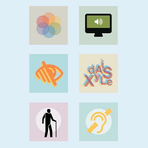
Inclusive Design Principles
It's just good to remember the Inclusive Design Principles. It's all about designing for all of us.
Illustration: inclusivedesignprinciples.org

Testing fonts for accessibility
A bite-sized guide to help you chose fonts with better legibility for all.
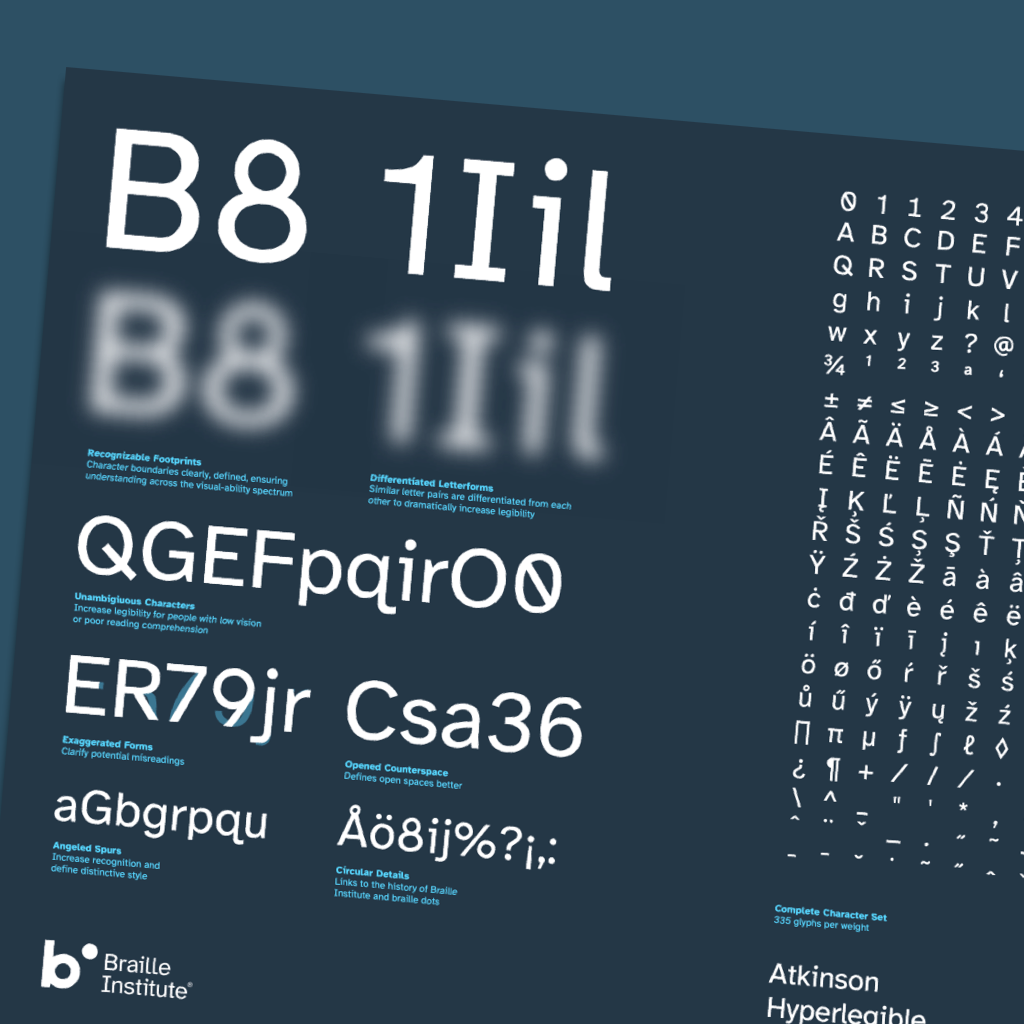
A free hyperlegible typeface from the Braille Institute
The Atkinson Hyperlegible font a new typeface was designed with a greater
legibility and readability for low vision readers. The Braille Institute has the
generosity to make it free for anyone to use.
By the way, A11y Toolbox uses
for the body content the Atkinson Hyperlegible!

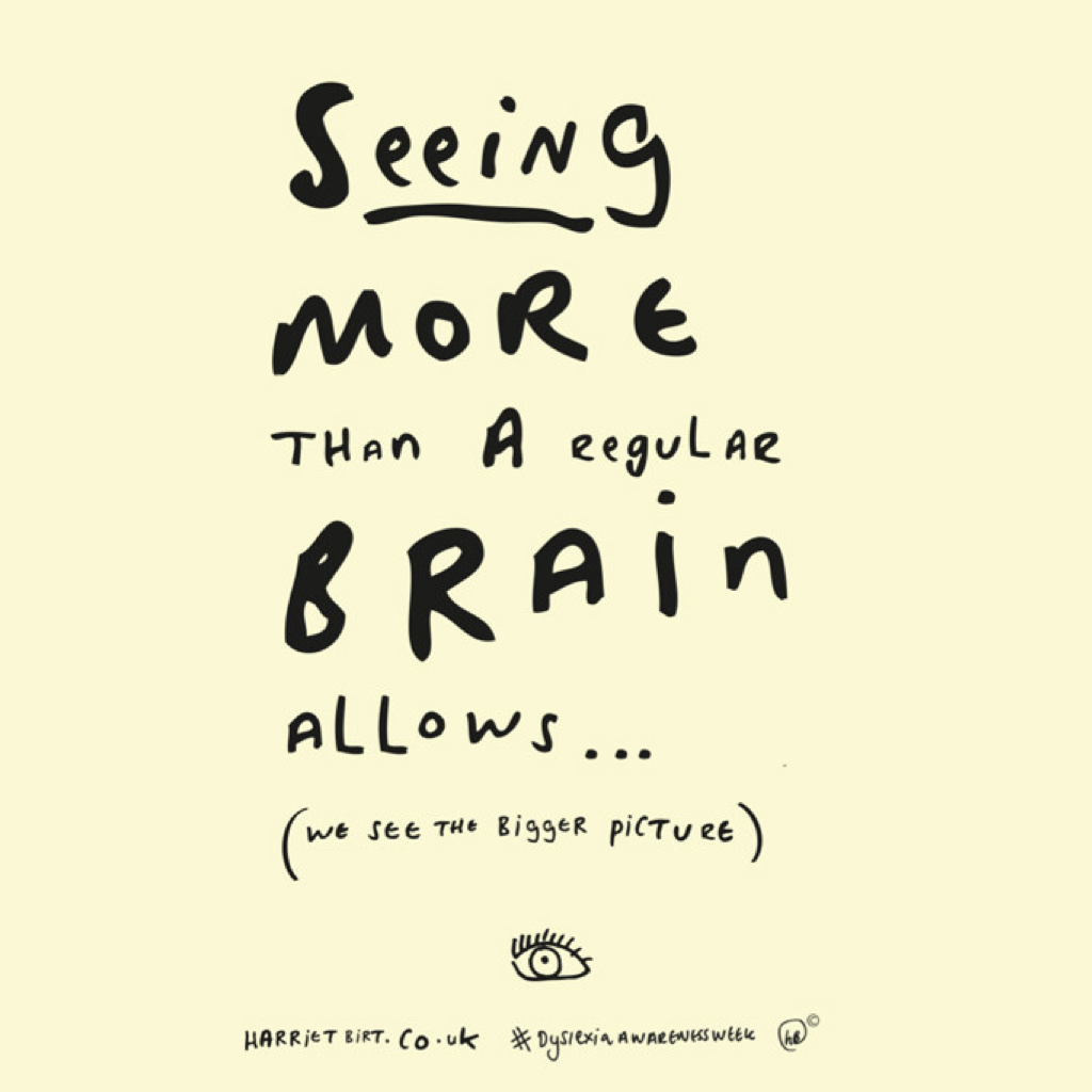
Dyslexia fonts
Dyslexia affects about 1 in 5 people worldwide. I am one of them! I
appreciate the article questions the utility of Dyslexic fonts. And it gathers
general font tips to help to improve the overall quality of your website's
typography.
Original Illustration: Harriet Birt
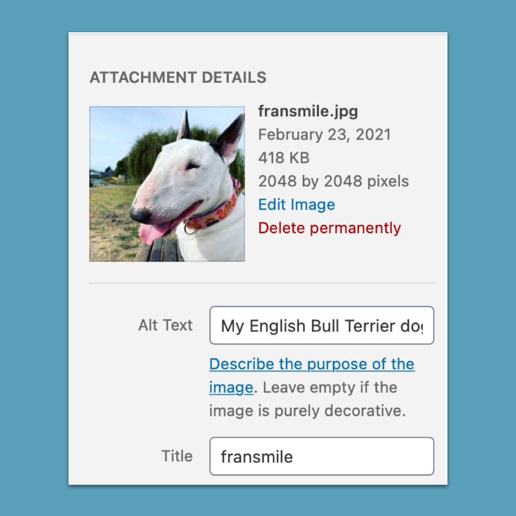
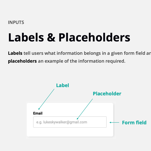
How to write better alt-text descriptions for accessibility
Adding alt-text to images is an important aspect of web accessibility. But do you know how to write a good alt-text description? And... have a look on the comments, they are also interesting.
Design for Accessibility: Six Do and Don’t posters
Since I'm learning to design for accessibility, I had to undesign a part of the design process taught during my design studies. The six Do and Don't posters on designing for accessibility released by the Home Office Digital have helped my Undesig Process.

Introduction to Web Accessibility
This free course presented by the W3C will give you solid foundations in accessibility and help you provide a better experience for everyone. Note: if you want to earn the certificate, you'll need to switch to the verified course.

Designing for accessibility is not that hard
Pablo Stanley wrote and illustrated a 7-steps guide to start designing for a more accessible web. A must-read article ?