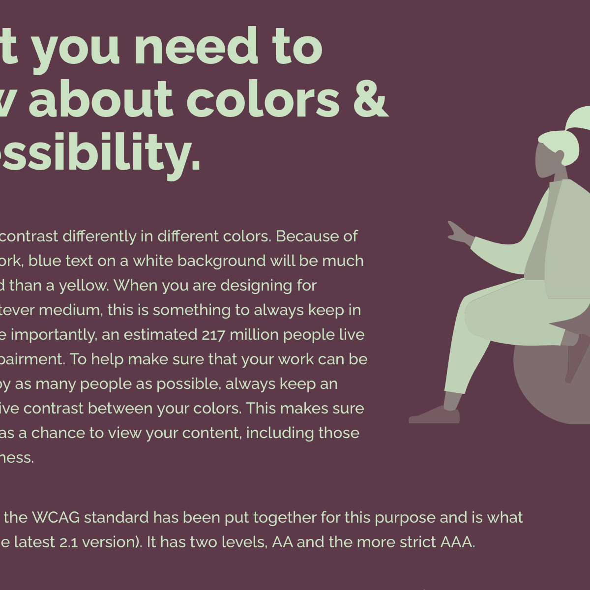
Color contrast
Color contrast is not just about ratios. It’s about making design choices that help people read, understand, and use interfaces. This selection brings together tools and resources that help designers understand, test, and improve color choices.
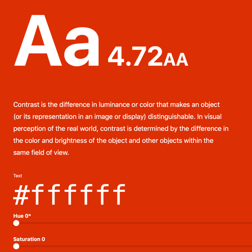
Color Contrast Grid by EightShapes
This online tool tests if the color combos are compliant with WCAG 2.0 minimum contrast. I like using it to test color combinations for buttons and text colors on different background colors.
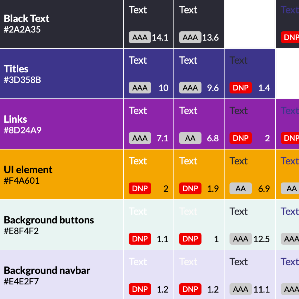
Making a Palette Accessible
When a designer revises an existing corporate palette for accessibility, the real challenge is to sell it to stakeholders. The Designer Colin Shanley shares his insights about testing a color palette for accessibility and how to persuade stakeholders to adopt the changes.
Illustration: Colin Shanley
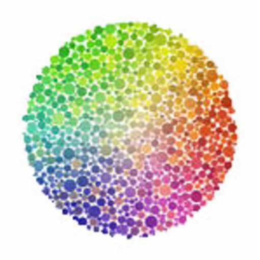
Color Oracle
About 10% of the population - mostly males - has a form of colorblindness.
Color Oracle is a free color blindness simulator for Windows, Mac OS and
Linux. It shows in real time what people with common color vision impairments
see.
Colorable
Another good tool to test color-contrast ratio quickly.

Accessible material design palettes with Color Tool
A classical tool, made by Google in 2014, to help you to build accessible color palette for your user interfaces and measure the accessibility of your own color combinations.
Color Review
Find, test & explore accessible colors. A pleasant and intuitive tool to help designers to build color palettes. Certainly the tool I use the most when I'm doing visual design.

Tanaguru contrast finder
A tool to help designers to find color combinations that provide the best color contrast ratio.