UX Design
Small interaction choices, layout decisions, or form patterns can have a real impact on how usable an interface feels. This selection is informed by recurring patterns observed during UX audits and reviews, and focuses on practical ways to design clearer, more usable interfaces.

The Risks of Imitating Designs
Too many times, I saw teams wanting to pursue unusable and inaccessible designs because Amazon, Google or Apple was doing it. Here's a concise article from Nielsen Norman Group on why those companies aren't always worth emulating.
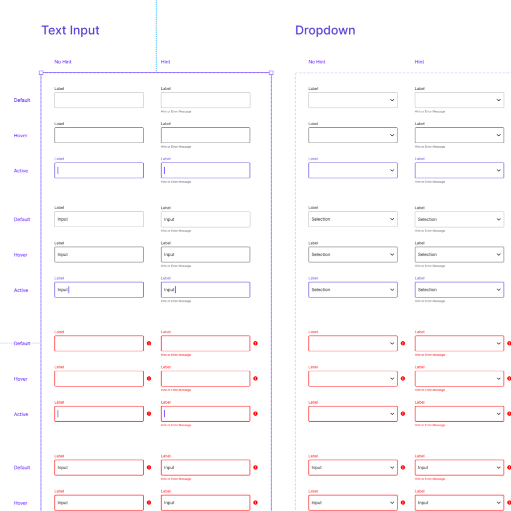
Figma: Accessible Form Fields
If only I found this component earlier! This Figma component designed by Tom Reinert will help you to design accessible forms: its initial contrast ratio is Level AA and has easily recognizable states.
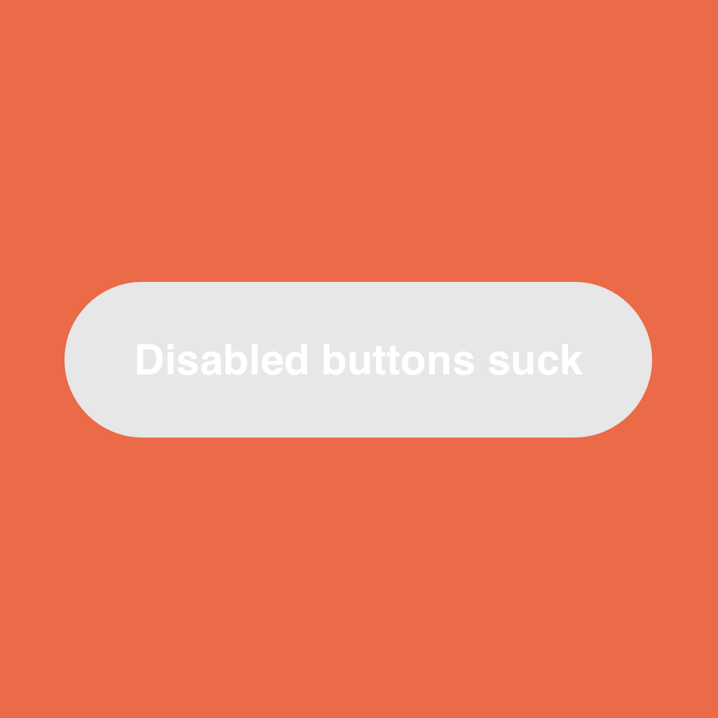
Disabled buttons suck
Disabled buttons create a lousy user experience and often create a big barrier for people with disabilities. Let's see what to do instead that will benefit to all users.

Stop Password Masking
Masking passwords is an old practice that’s commonly implemented in sign-up and log-in forms. But masking passwords doesn't even increase security, but it costs your company business due to login failures.
How to design an accessible form
The UX Designer, Núria Peña presents the best practices of how to make forms accessible for as many people as possible from a design perspective.
How to make an accessible form?
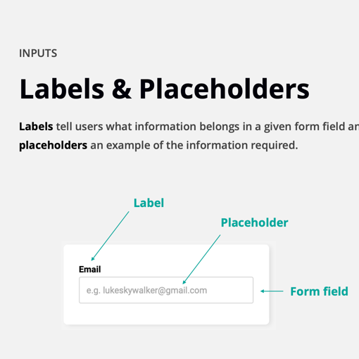
Designing a form is not that easy. These past few years we can often see that placeholder texts in the form fields are used in place of label names with fun micro-animations. But what about their accessibility?