Design
Design decisions shape how accessible an interface truly is. A curated selection of articles, talks, and resources focused on color, typography, interaction, and system-level design decisions, grounded in real practice rather than theory.

From A Colourblind Designer To The World: Please Stop Using Red And Green Together
Andrew Wilshere, a red-green colorblind, shares the most common problems he encounters when using websites and apps.
Illustration: Mark Stebnicki

Web Accessibility Guidelines: Carnegie Museums
The Carnegie Museums of Pittsburgh have published and shared their Web Accessibility Guidelines that include best practices and resources - a good way to learn from Accessibility professionals to make our designs more accessible!
Giving a damn about accessibility
Sheri Byrne-Haber wrote this free practical handbook for designers about
accessibility.
(PDF and audio versions)
Illustration: Passeio
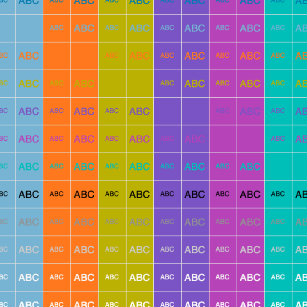
Making a Palette Accessible
When a designer revises an existing corporate palette for accessibility, the real challenge is to sell it to stakeholders. The Designer Colin Shanley shares his insights about testing a color palette for accessibility and how to persuade stakeholders to adopt the changes.
Illustration: Colin Shanley

Testing fonts for accessibility
A bite-sized guide to help you chose fonts with better legibility for all.
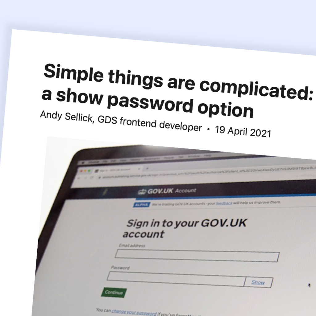
Simple things are complicated: making a show password option
A good article showing the complexity behind a design pattern that everyone thinks is super simple. I also appreciate the article explains what solutions the team chose to keep the form secured.
What is design debt?
The lesser-known cousin of the Technical Debt, the design debt gathers all the good design concepts or solutions that were skipped in order to reach short-term goals. Like usability tests, an out of date design system and... accessibility that has been neglected!
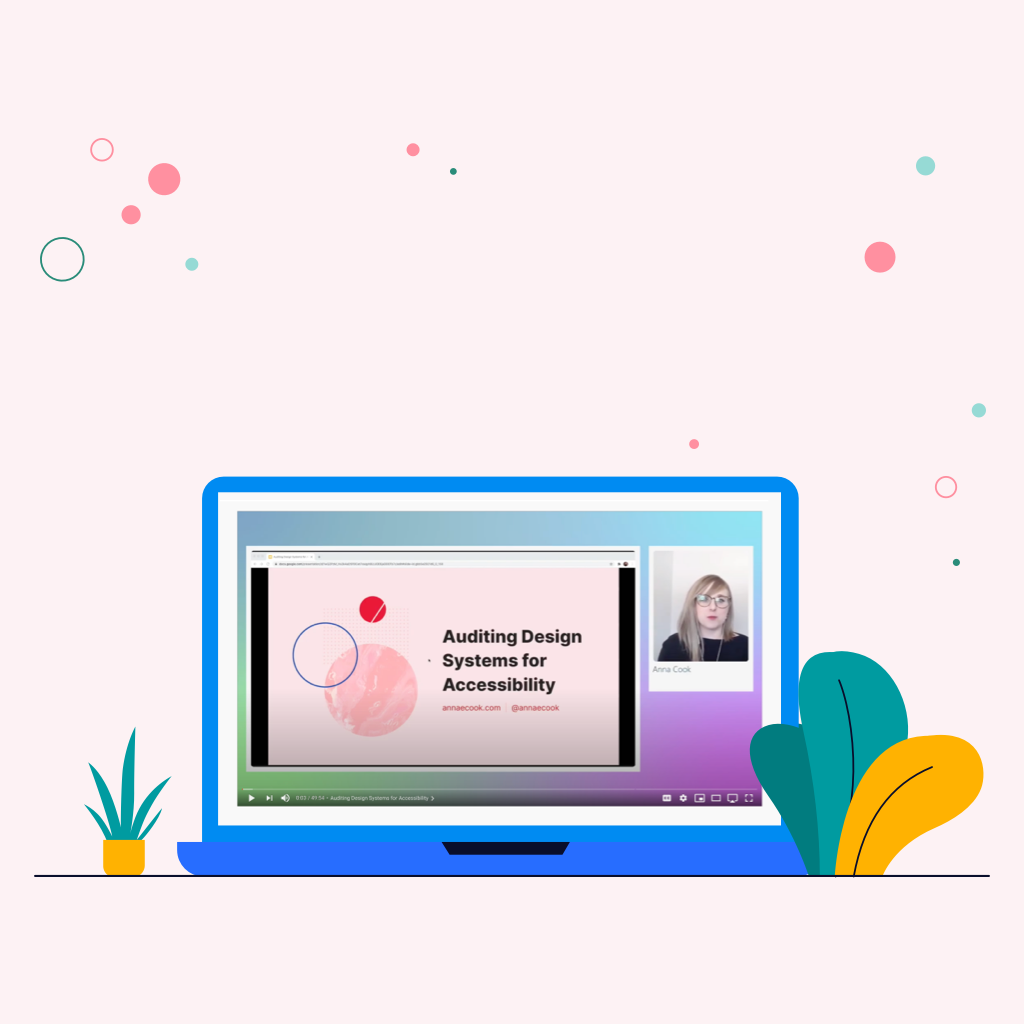
Auditing Design Systems for Accessibility
In this Axe-Con virtual conference, Anna Cook, Senior Product Designer speaks about how to audit components for accessibility issues from design to code using plugins, best practices, and testing tools.
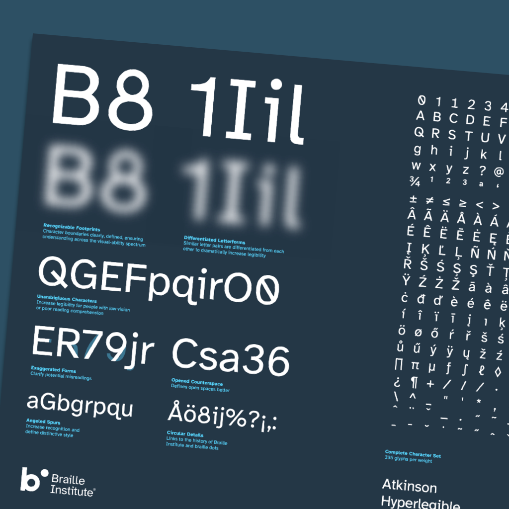
A free hyperlegible typeface from the Braille Institute
The Atkinson Hyperlegible font a new typeface was designed with a greater
legibility and readability for low vision readers. The Braille Institute has the
generosity to make it free for anyone to use.
By the way, A11y Toolbox uses
for the body content the Atkinson Hyperlegible!