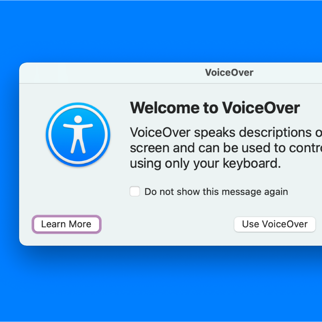
An Introduction to macOS Voice Control
The Designer and A11Y advocate, Eric Bailey shows how to enable Voice Control and explains how to design for it. This article is also a great reminder about the importance of labelling buttons and icons!
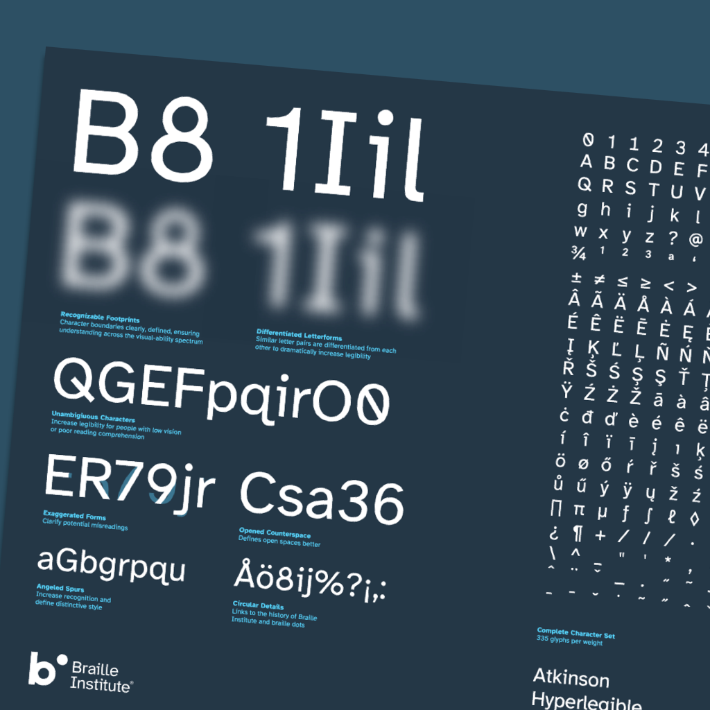
A free hyperlegible typeface from the Braille Institute
The Atkinson Hyperlegible font a new typeface was designed with a greater
legibility and readability for low vision readers. The Braille Institute has the
generosity to make it free for anyone to use.
By the way, A11y Toolbox uses
for the body content the Atkinson Hyperlegible!

Accessibility is Hard, and Other Myths – Devon Persing
During this Accessibility Talks virtual meet-up, Devon speaks about common misconceptions about digital accessibility work and introduces ways to think about disability, assistive technology, and a more holistic approach to accessibility.
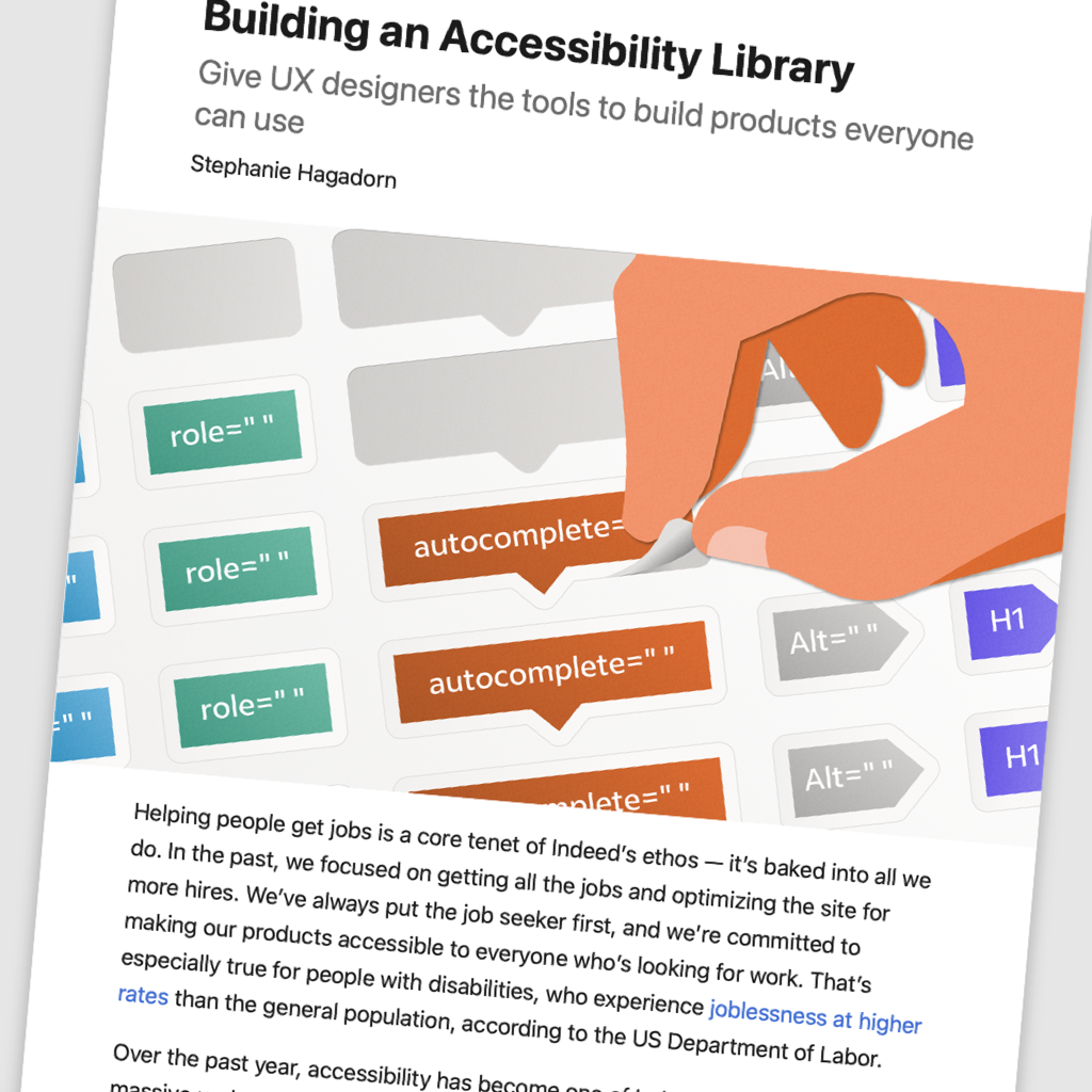
Building an Accessibility Library
An interesting article about how providing designers accessibility tools have helped them to apply their knowledge and develop a greater understanding of accessibility.

Stop Password Masking
Masking passwords is an old practice that’s commonly implemented in sign-up and log-in forms. But masking passwords doesn't even increase security, but it costs your company business due to login failures.

WCAG for designers
A checklist wrote by the British Designer Gari Reid to help designers ensure the product they design comply with the Web Content Accessibility Guidelines (WCAG).
(I personally keep it into my favorites!)
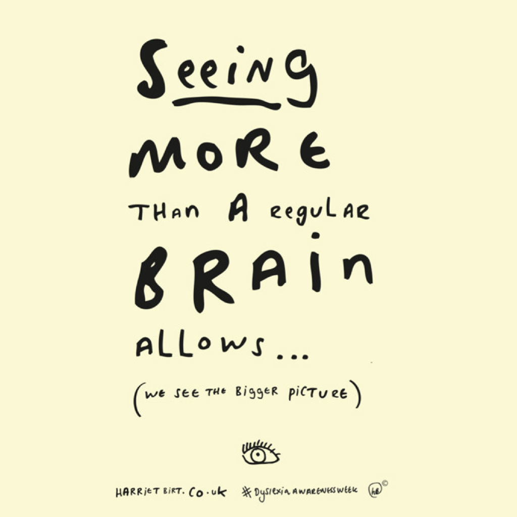
Dyslexia fonts
Dyslexia affects about 1 in 5 people worldwide. I am one of them! I
appreciate the article questions the utility of Dyslexic fonts. And it gathers
general font tips to help to improve the overall quality of your website's
typography.
Original Illustration: Harriet Birt
How to write better alt-text descriptions for accessibility
Adding alt-text to images is an important aspect of web accessibility. But do you know how to write a good alt-text description? And... have a look on the comments, they are also interesting.
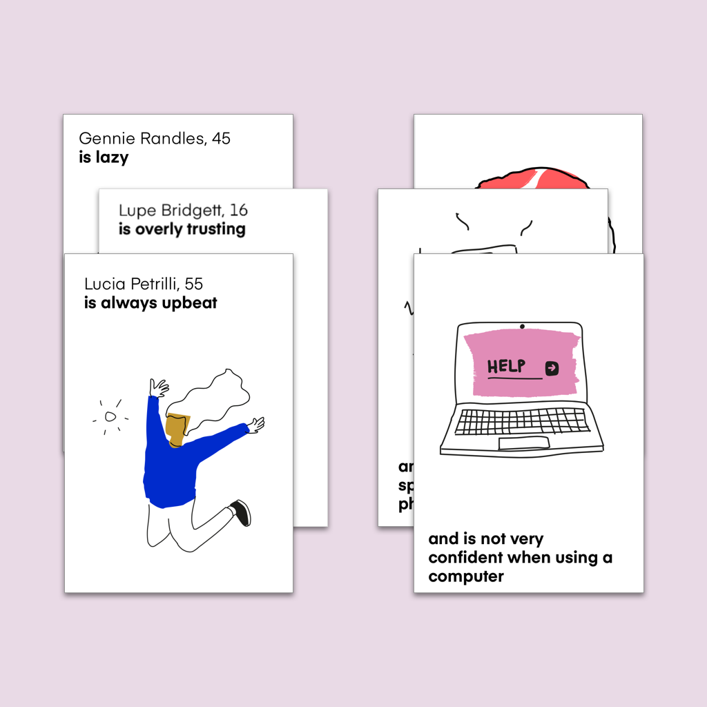
Cards for Humanity
Cards for Humanity is a practical tool to help you design more
inclusively.
How to play? Deal two cards: a person and a trait. Together they
make a random user scenario. You can use this scenario to test your concepts,
products or from a different perspective.